
Driver app UX/UI design
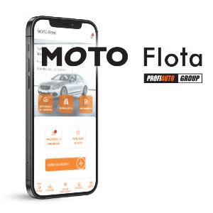
Client: Moto Flota
Industry: Automotive
Project duration: 2025Short: UX/UI layer for a mobile fleet management application used by the client's network drivers.
Who the Client Is
Moto Flota is one of the leaders in fleet management. The company currently manages over 65,000 vehicles and works with an extensive network of more than 880 service centers across the country.
Project Goal
The goal of the project was to design a mobile application for drivers using fleet vehicles. The tool was intended to genuinely support users in the day-to-day management of their company cars — simplifying processes, reducing the time required to complete tasks, and minimizing the risk of missing important deadlines.
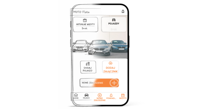
The application was designed to enable, among other things:
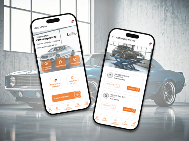
monitoring vehicle status and service due dates,
quick and convenient contact with the service network,
intuitive booking of service appointments,
reporting damages and breakdowns,
ongoing control of matters related to fleet vehicle usage.
Our responsibility covered the comprehensive design of the UX and UI layers of the application, including:
identifying all key user scenarios,
developing complete user flows covering all in-app processes,
preparing a full set of wireframes presenting the system’s structure and logic,
creating an interactive prototype to test flows and validate assumptions,
designing detailed UI mockups of all application screens.
Result
The outcome of our work was a complete application framework, including:
a full set of wireframes presenting the structure of all screens,
an interactive prototype demonstrating complete user flows across key scenarios,
detailed UI views of individual screens,
a library of ready-to-use components supporting further development and consistent implementation.
The materials created formed a solid foundation for the next stages of work — implementation, testing, and final deployment of the application.
Technologies
Figma – wireframes, interactive prototype, and full UI design
Affinity Designer – development of graphic elements and visual refinements
AI image generator – support in creating conceptual and illustrative materials
Challenges
Although the project was a natural extension of a previously developed solution for the service network, the driver-facing application required a completely different design approach. The target audience, context of use, and user needs differed significantly from the earlier product.
The interface needed to be more modern, visually appealing, and highly intuitive. Drivers often use the app in situations requiring quick action — reporting damage, booking appointments, checking vehicle status — which made it essential to reduce the number of steps, simplify communication, and establish a clear information hierarchy.
At the same time, the project had to remain consistent with the existing brand identity, ensuring the new application would be recognized as part of the same product ecosystem. This required balancing a fresh, modern design with established visual brand elements.
Another important challenge was designing an interface that would be fully responsive and functional across different mobile devices — both Android and iOS. This required accounting for system differences, navigation patterns, and platform-specific user behaviors.
Process
In line with our working standards, we focused from the very beginning on close, regular, and transparent collaboration with the Client’s team. The goal was not simply to design an application, but to jointly create a solution that genuinely supports drivers in their everyday use of fleet vehicles.
Each stage of the project followed an agile approach. We worked iteratively in cycles that included:
strategic workshops and requirement clarification,
design and presentation of solutions,
collecting feedback from the Client and target users,
implementing improvements and refining details.
This approach allowed us to continuously validate assumptions, eliminate ineffective solutions, and systematically refine the product. As a result, the final outcome was not a one-off concept but a consciously developed and tested solution that fully met the Client’s expectations.
1. Needs Assessment and Requirements Analysis
The project began with a series of workshops with the Client’s team. The goal was to precisely define business requirements and identify the real problems the application needed to solve. At this stage, we also defined the target user profile — a driver using a fleet vehicle in their daily work.
The workshops resulted in an overall outline of the application — its main functions, priorities, and scope of responsibility.
Based on the analysis, we established key design principles:
a modern and visually attractive interface,
clear and intuitive process flows,
reducing the number of steps in critical tasks,
maximum simplification of interactions while maintaining full functionality.
This stage laid the foundation for further conceptual and design work.
2. Wireframing and Prototyping
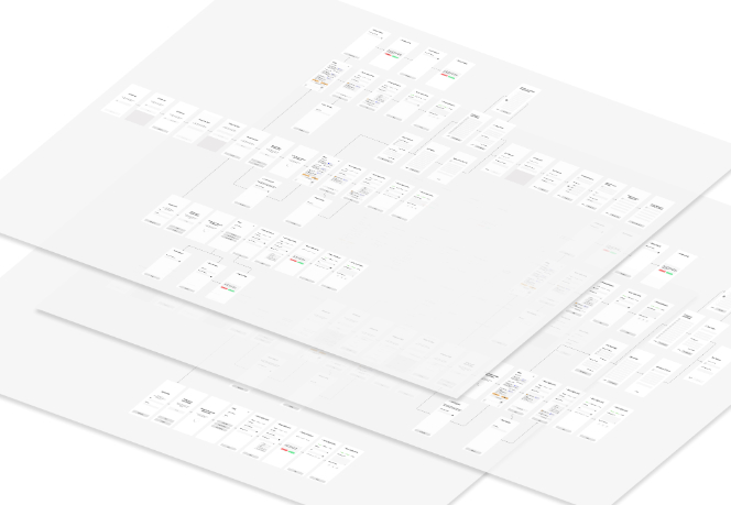
Based on the agreed assumptions, we prepared a detailed application framework and a complete set of wireframes presenting the structure of all screens and their relationships. At the same time, we developed an interactive prototype reflecting key process flows and content presentation within the app.
Our iterative approach and regular consultation sessions with the Client allowed us to systematically refine interface logic and validate design decisions. Each presentation provided an opportunity to discuss flows, simplify processes, and eliminate potential usability barriers.
Thanks to the interactive prototype, the Client was able to go through all core functionalities and test the application’s logic in practice — before the visual layer was finalized.
This made it possible to identify the full spectrum of user scenarios, including edge cases and potential issues that needed to be addressed during UI design.
3. UX/UI Design
At this stage, we developed the complete visual layer of the application — from color palette and typography, through the component system, to the detailed presentation of information and data input patterns.
$Concepts and Iterations
We began by preparing several initial visual concepts. Each was presented together with a clear rationale behind design decisions and an explanation of their impact on usability and process flow.
After selecting one direction, we systematically refined it — developing interface details, information hierarchy, and user interaction patterns.
This approach allowed us to:
avoid investing time in solutions that would not be implemented,
respond quickly to changing requirements,
identify and eliminate usability issues early on.
Each modification was a deliberate response to a specific user need or business challenge.
$Final Design
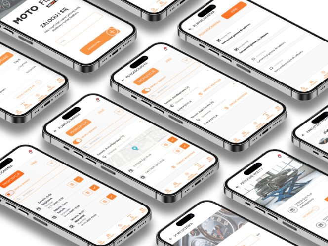
The final outcome was a coherent, modern, and functional interface featuring, among others:
a clear dashboard presenting key information for the user,
an intuitive system for booking and managing service appointments,
a transparent and easy-to-understand notification system,
simplified and user-friendly communication language.
The final design was not an aesthetic compromise, but a consciously crafted tool that:
supports drivers in fulfilling responsibilities related to fleet vehicle usage,
reduces the time needed to arrange service visits,
helps organize vehicle-related matters,
simplifies reporting damages and breakdowns.
The result is an interface that not only looks good but, most importantly, solves real user problems and streamlines everyday fleet vehicle management.
Further Development
The prepared design materials formed a complete and well-structured foundation for the next stages of product development — implementation, testing, and final deployment.
With detailed mockups, an interactive prototype, and a structured component library, the development team received precise guidelines regarding:
application structure and screen relationships,
process logic and user scenarios,
interface behavior in both standard and exceptional cases,
consistent visual rules and component system.
This level of documentation significantly reduced the risk of misinterpretation during development and accelerated the implementation process.
As a result, the delivered foundation was not merely a graphic design, but a thoughtfully structured framework ready for further digital product growth.